- Call Us
- +1 863 687 8545
The Hidden Advantage of Typography

Graphic design is composed of a number of factors. One critical element of graphic design is font and typography. It may seem as if any old lettering will work as long as the message is clear and compelling, but that simply isn’t the case. Digital technology, the Internet, and virtually all forms of advertising rely on two key factors – a message and a call to action that can only be conveyed in words. Those critical factors depend on the shape, style, and form of the letters that make up those words.
The hidden advantage of typography – it’s best kept secret – is that it helps elicit an emotional response from your consumers. In fact, in many cases, it can steer them toward the emotional response you prefer. Typography is defined as “the art and technique of arranging type to make written language legible, readable, and appealing when displayed.” It’s an additional tool in your graphic designer’s toolbox for grabbing the attention of your target market and urging them to take a specified action. Savvy graphic designers also understand the importance of readability and the psychology behind fonts and typefaces.
Why does the right typography make such a huge difference? Because details like size, the spacing between letters and words, serifs, and letter tails make an impact on the mood of your target market. Understanding the way people read makes word design impactful to creating business to consumer connection and engagement. Well-designed typography makes the reader feel good, while thoughtless or poorly designed fonts might elicit feelings of sadness or simply make the reader feel like reading is too much work because the eye struggles to move smoothly across the page, posters, sign, or screen.
The right font, in combination with the right marketing message, and aimed at the right target market, is vital to the success of your marketing campaign. Well-designed fonts may not help your consumers understand the message better, but it may make them you feel the emotions you want them to feel. Certain fonts may elicit feelings of laughter, fear, humor, calmness, and joy.
Graphic designers typically choose from the four basic types of fonts:
- Serif Fonts – letters with short lines on the edges (for a reserved or traditional feeling)
- Sans-Serif Fonts – letters without lines on their edges (for an informal or lighthearted feeling)
- Script Fonts – letters designed to mimic handwriting (for a personal touch)
- Decorative Fonts – letters created from original designs (for a unique, one-of-a-kind appeal)
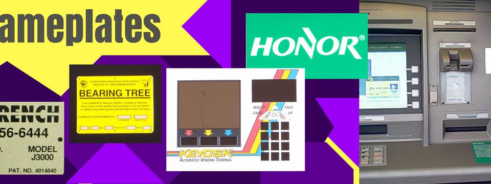
Professional graphic designers will tell you to stick to two fonts per design, choose an anchor font, and choose line lengths carefully. The goal of good typography is to make your message enjoyable and easy to read for your consumer. That makes spacing and font size important to the finished product. This holds true for posters, decals, nameplates, banners – every graphic design product DPRINT creates.
Peruse our entire product suite today, then contact our graphic designers for an amazing product consultation. We’ll help you choose the right typefaces, colors, and shapes to elicit the response you want from the clients you need. While you’re on our website, make sure to sign up for the Lasting Impressions By DPRINT newsletter. The latest edition lands in your inbox tomorrow. You don’t want to miss the graphic design, CEO, and industry trending news in every issue.


